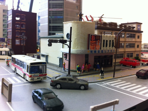
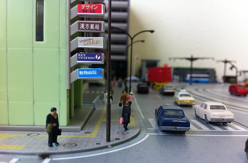
I keep switching my work layout around, moving buildings around like puzzle pieces to try to get more of the look I want.
I've recently been trolling Japan with the help of Google Street View and it's obvious that my Japanese layout will have to be more congested if I REALLY want to get a Japanese look to it.
Tokyo is just packed with buildings, streets and alleys. On top of that, there are bike racks, vending machines and MANY small details all over the place. I've been trying to keep the layout open so every building can be seen from the front, but I might have to bite the bullet and "get crowded".
At any rate, here are the latest and greatest shots. Comments welcome!
More on my FLICKR: http://www.flickr.com/photos/malcojojo/sets/72157628630757331


This looks really good.
ReplyDeleteI know what you mean about the congestion. I have found it a real challange to pack things close enough together to make it look right without hiding everything that's not right in the front. Because of this, I believe modeling Tokyo lends itself well to shallow scenes.
Keep up the good work