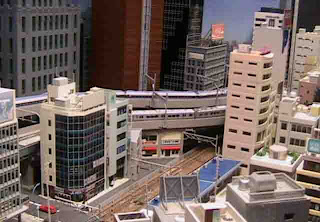
It has the "Historic Area", transitions and "Big City Area". It even has an awesome subway section below. Just goes to show - you may think you have a new and exciting idea...and you probably did. But, it doesn't mean that someone else hasn't had that same idea already. :) Everyone's take on an idea is different, however, so it's always interesting to see what comes out of an idea when seen through a new vision.
I love the Setagaya layout. It can be found here: http://japanese-trains.com/setagaya/
The website makes me a little crazy, but the layout is fantastic. The layout is based on the Setagaya tram line in Japan. The rich details, multi-levels and someone simple track work makes this the ideal benchmark layout for me.
Looking at the layout above, I have to smile. It's EXACTLY what I want to do down to the positions and spacing of the sections. It's uncanny. So, not I have something to get both inspiration and knowledge from.
Sadly, it looks like this layout was dismantled back in 2006.
Check out some of the section images.
<>


No comments:
Post a Comment